Artea
(2025)Project overview
The challenge
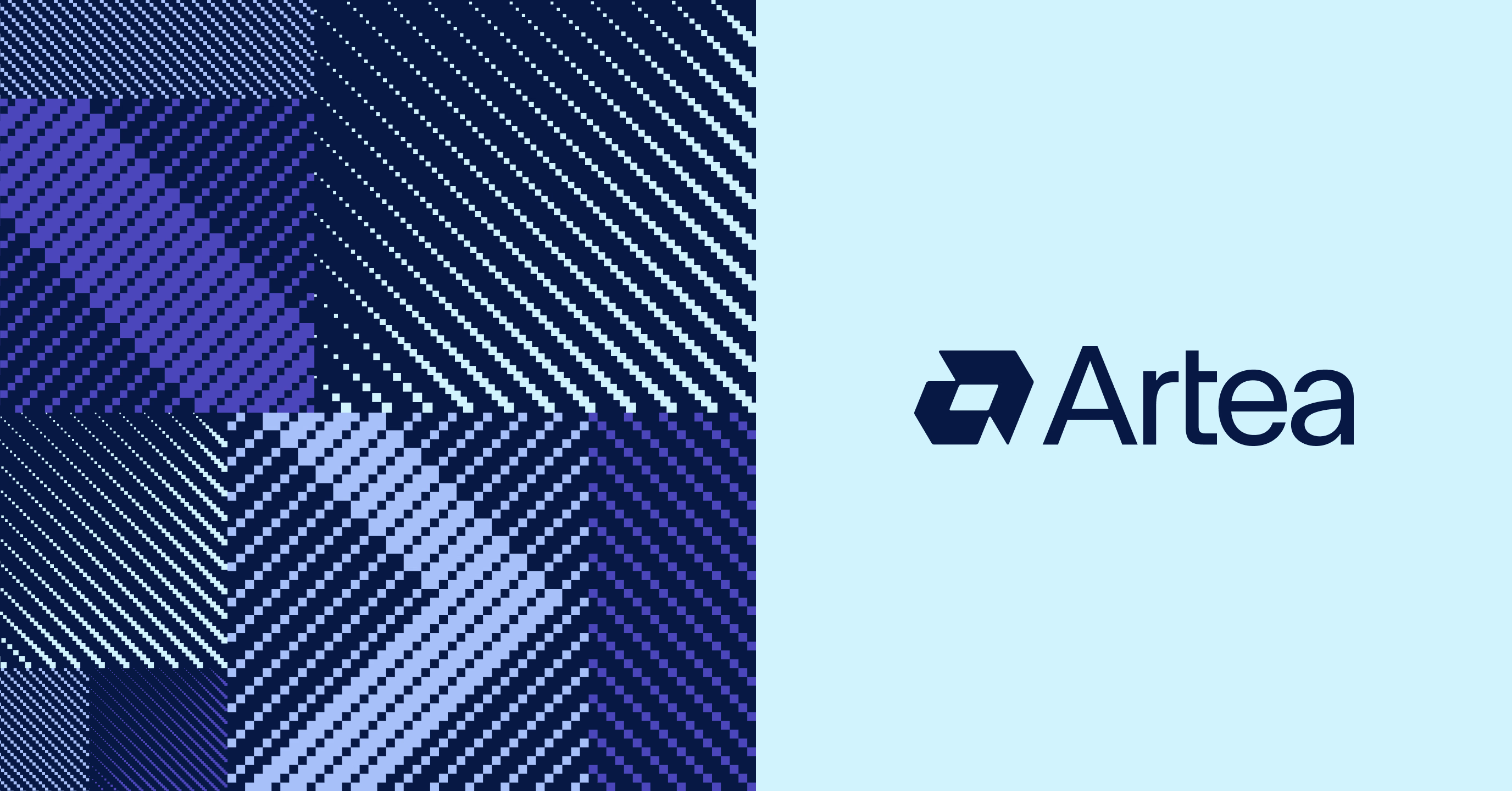
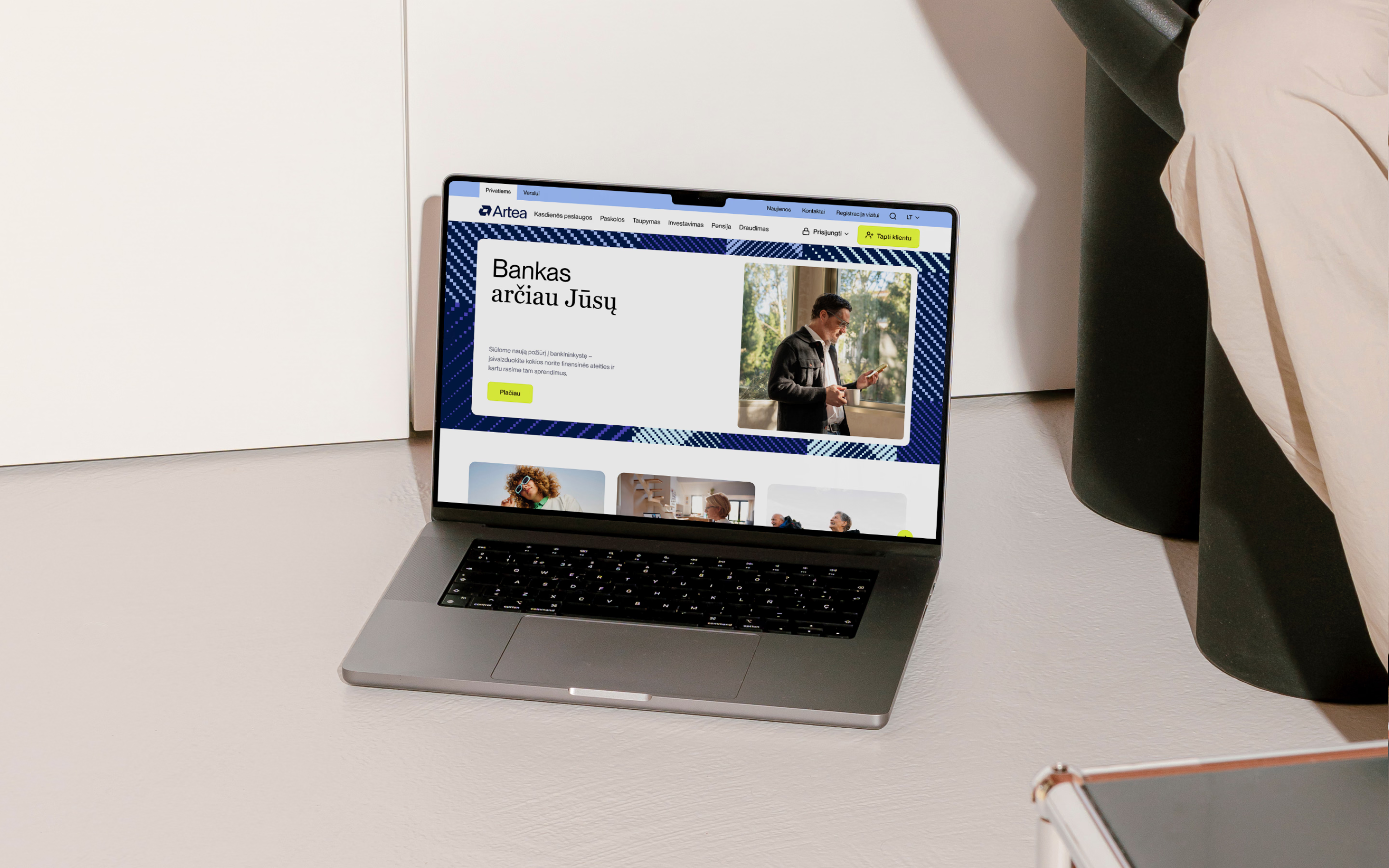
Following Artea's rebrand, the challenge was to bring a bold new identity into a complex digital ecosystem. The transformation had to go beyond new colours and typography - the brand needed to work consistently across the website, mobile app, self-service environments and other everyday banking experiences.
We helped create the digital system behind this change. By redesigning key platforms and establishing a shared foundation for future products, we turned the new identity into an experience that feels recognisably Artea across every customer touchpoint.
- project type
- Website & Design System
- services
- DiscoveryUX designUI design
- teams involved
- Synthesis CGAndstudio
brand translation
From brand identity to digital language
The new identity created by Andstudio gave Artea a distinctive and expressive visual direction. Our role was to translate that vision into practical digital principles, defining how typography, colour, imagery, graphic elements and motion should behave within real interfaces.
A banking experience needs to communicate personality while remaining clear, reliable and easy to navigate. We explored how expressive brand elements could create recognition and energy without competing with important information or essential actions.
The result is a flexible digital language that preserves the character of the new identity while adapting naturally to every digital product - from website to app and self-service interfaces.
design system
A system built to scale
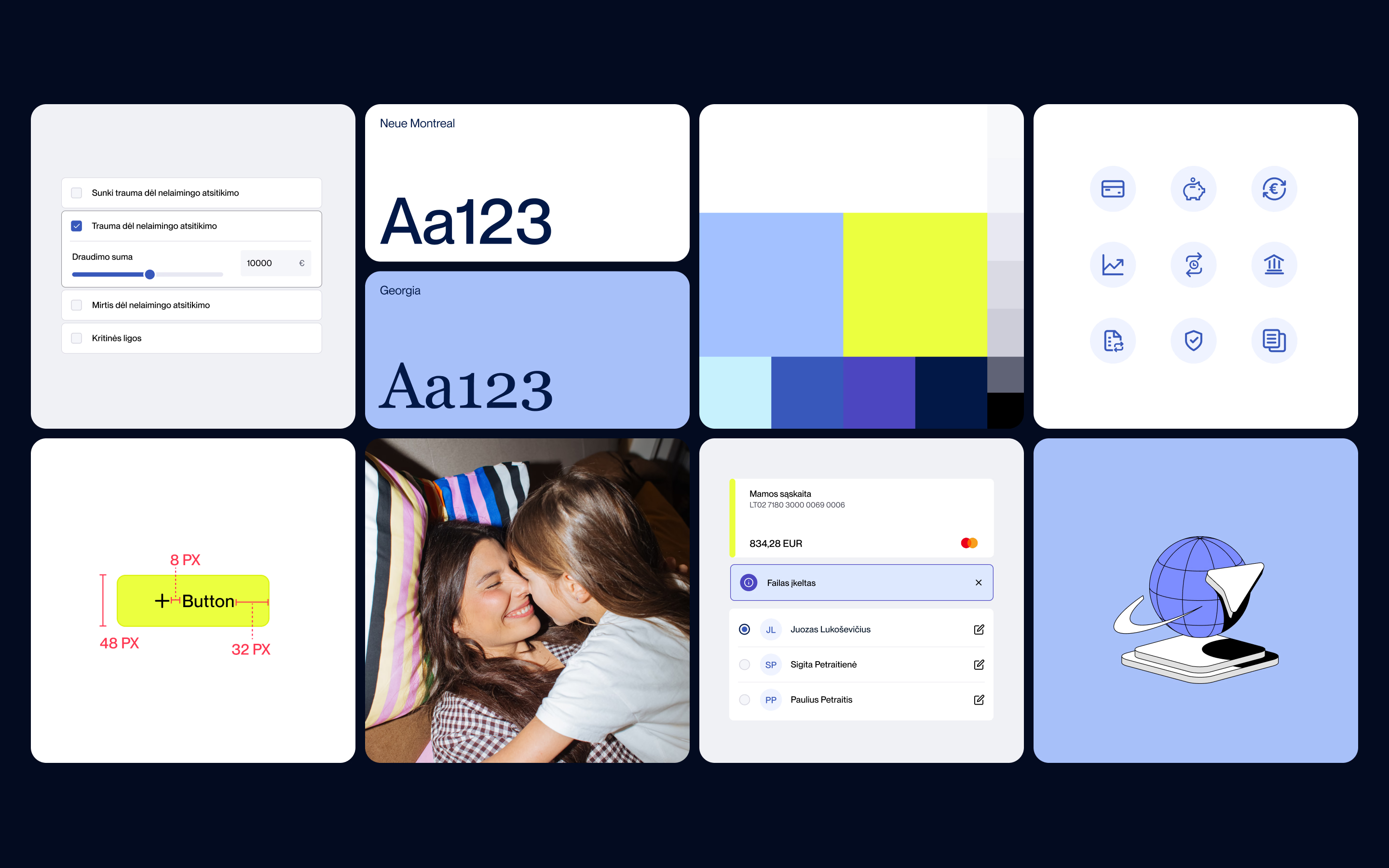
We transformed the visual direction into a scalable design system for Artea's growing digital ecosystem. Reusable components, shared interaction patterns and clear visual rules created a common foundation for both design and development teams.
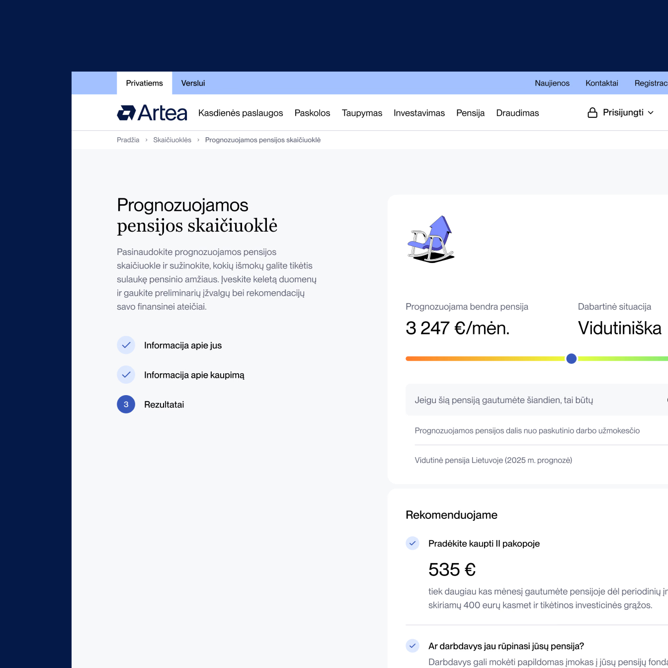
The system covered familiar interface elements such as navigation, forms, buttons, cards and feedback states, while remaining flexible enough to support different products and use cases. Instead of designing each platform independently, teams could build on established patterns and focus on the needs of each experience.
For the main website, we also developed a modular block-based structure. This let different pages, products and campaigns be built from reusable elements while keeping a consistent experience and giving Artea's team more flexibility to manage content over time.
product ecosystem
One experience across multiple products
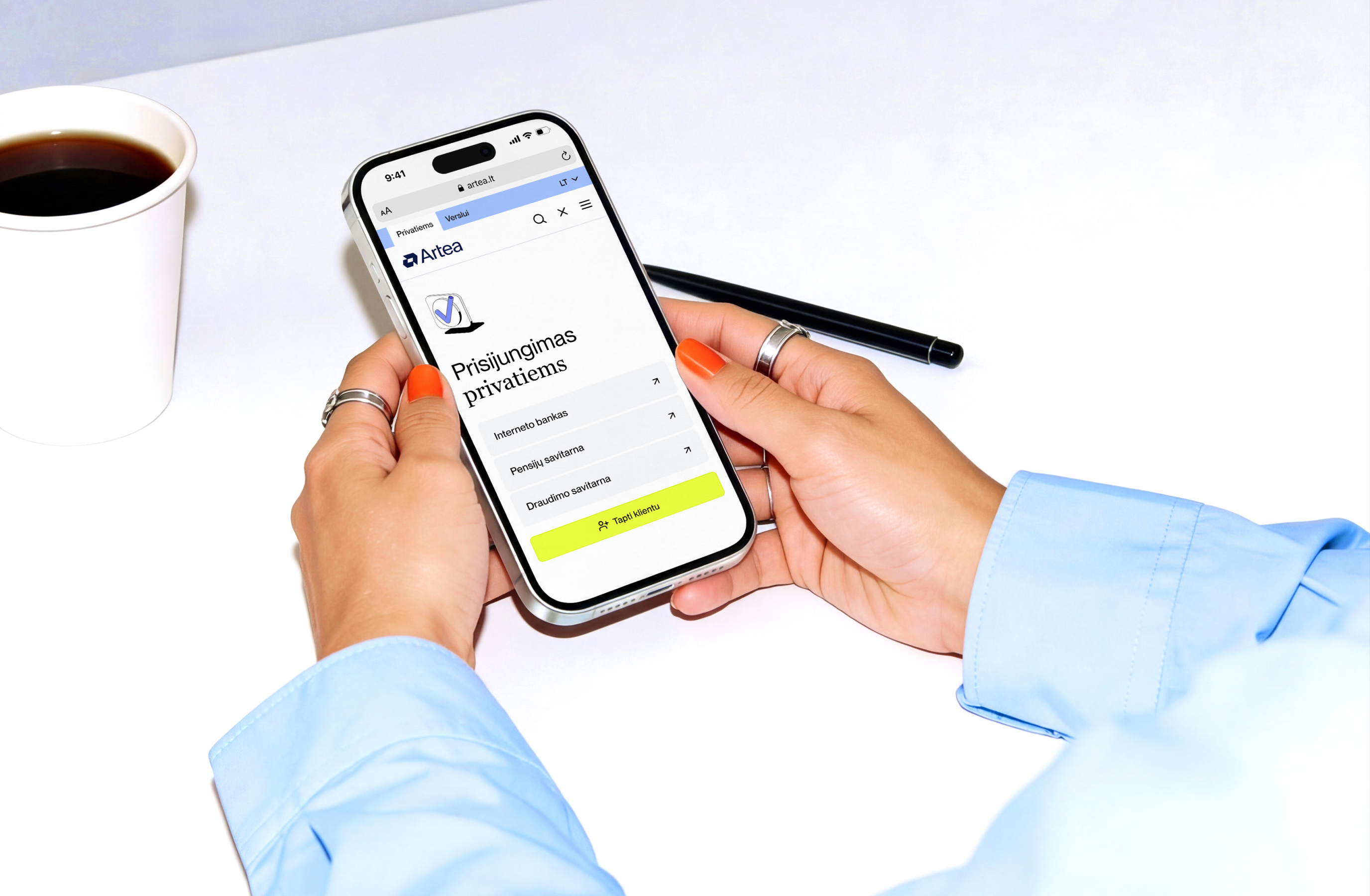
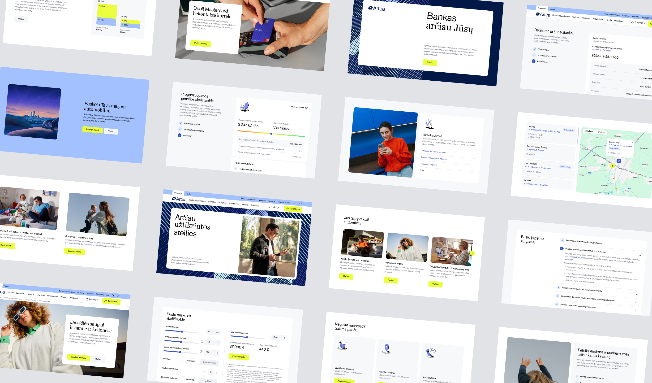
The system was applied across Artea's key digital touchpoints - the mobile app, self-service platforms, the main website and other customer-facing environments. Each platform had its own technical constraints, content requirements and user behaviours, so consistency could not mean simply repeating the same layouts everywhere.
We adapted shared components and interaction patterns to fit each context while preserving a familiar overall logic. Essential actions, visual cues and behaviours stayed recognisable, helping customers move between Artea services with less friction.
Together, the platforms began to feel like connected parts of one digital ecosystem rather than separate products shaped by different rules.
experience enablers
Modular page building
Reusable content blocks let Artea's team create and update different page types while protecting the site's overall structure and visual consistency.
Consistent interaction patterns
Shared navigation, form behaviours, feedback states and interface conventions create familiarity across products and make everyday actions easier to understand.
Flexible brand expression
The digital language can shift between expressive communication and functional banking environments without losing Artea's distinctive character.
Clear information hierarchy
Purposeful typography, colour and layout help users scan complex information, recognise priorities and find the next action more easily.
A shared product foundation
A common design system gives teams a reliable starting point for new features and platforms while reducing fragmentation across the ecosystem.
keep exploring